
Overview

PACER Center is a nonprofit dedicated to expanding opportunities for children and young adults with disabilities and their families. While their resources are impactful, the existing website felt cluttered, outdated, and difficult to navigate — especially for users with cognitive or visual impairments.
This redesign project focused on enhancing accessibility, improving information architecture, and updating the visual design to make PACER’s vital content more usable and inviting.
My Role
UX/UI Designer – Solo Project
I was responsible for end-to-end UX research, wireframing, prototyping, visual design, and user testing.
The Problem
Overwhelming amount of links on the homepage
Inconsistent visual hierarchy
Poor mobile responsiveness
Low accessibility scores (color contrast, alt-text issues)
Difficult navigation for users with screen readers or neurodiverse needs
Goals
Streamline content and navigation
Improve accessibility across all pages
Modernize the visual design while maintaining PACER’s identity
Prioritize clarity for parents, educators, and youth users
Research
User Testing
Users need to find tailored resources quickly.
Terminology was often confusing or too clinical.
The site didn’t feel youth-friendly or emotionally supportive.
Heuristic Evaluation
Analyzed the current PACER.org against usability heuristics. Major issues included:
Hidden navigation pathways
Lack of visual consistency
Redundant page structures
User Stories
As a parent, I want to find help by topic so I don’t have to browse every category.
As a teacher, I need a quick way to link trusted resources for my students.
As a student, I want a place that feels like it was made for me, not just adults.
User Flow
Current user flow (left) and updated user flow(right)

Design
Wireframes
Sketches
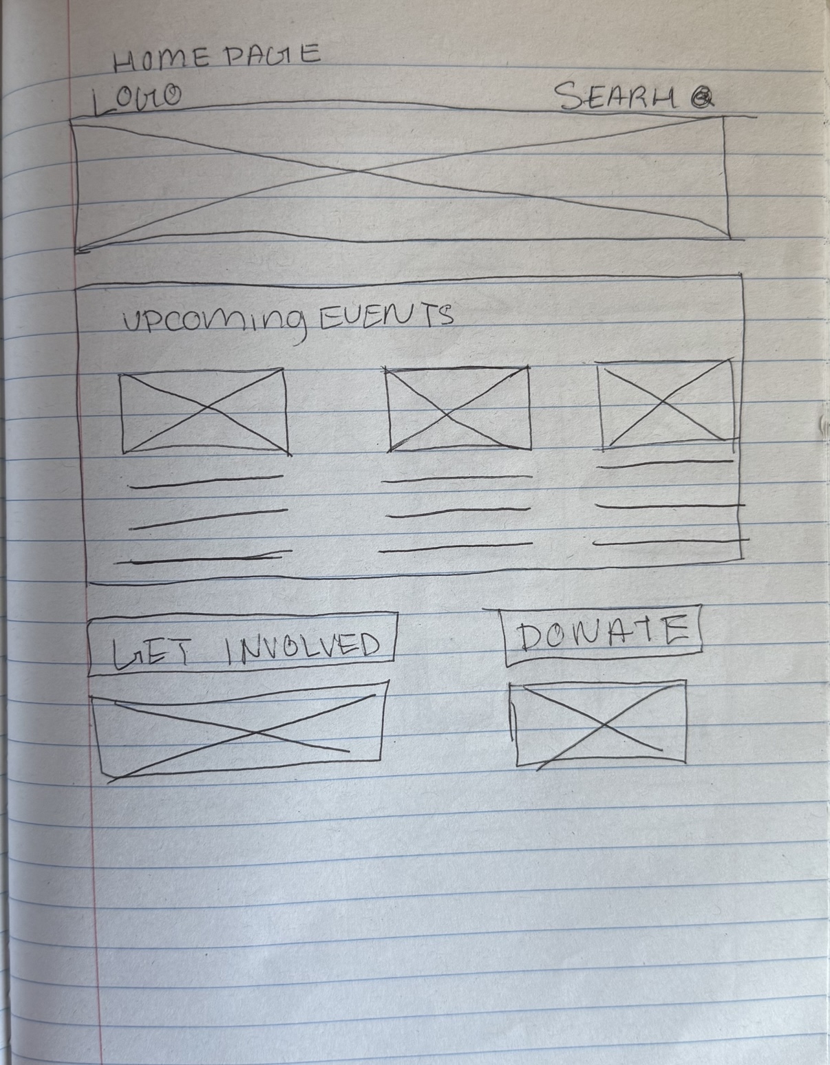
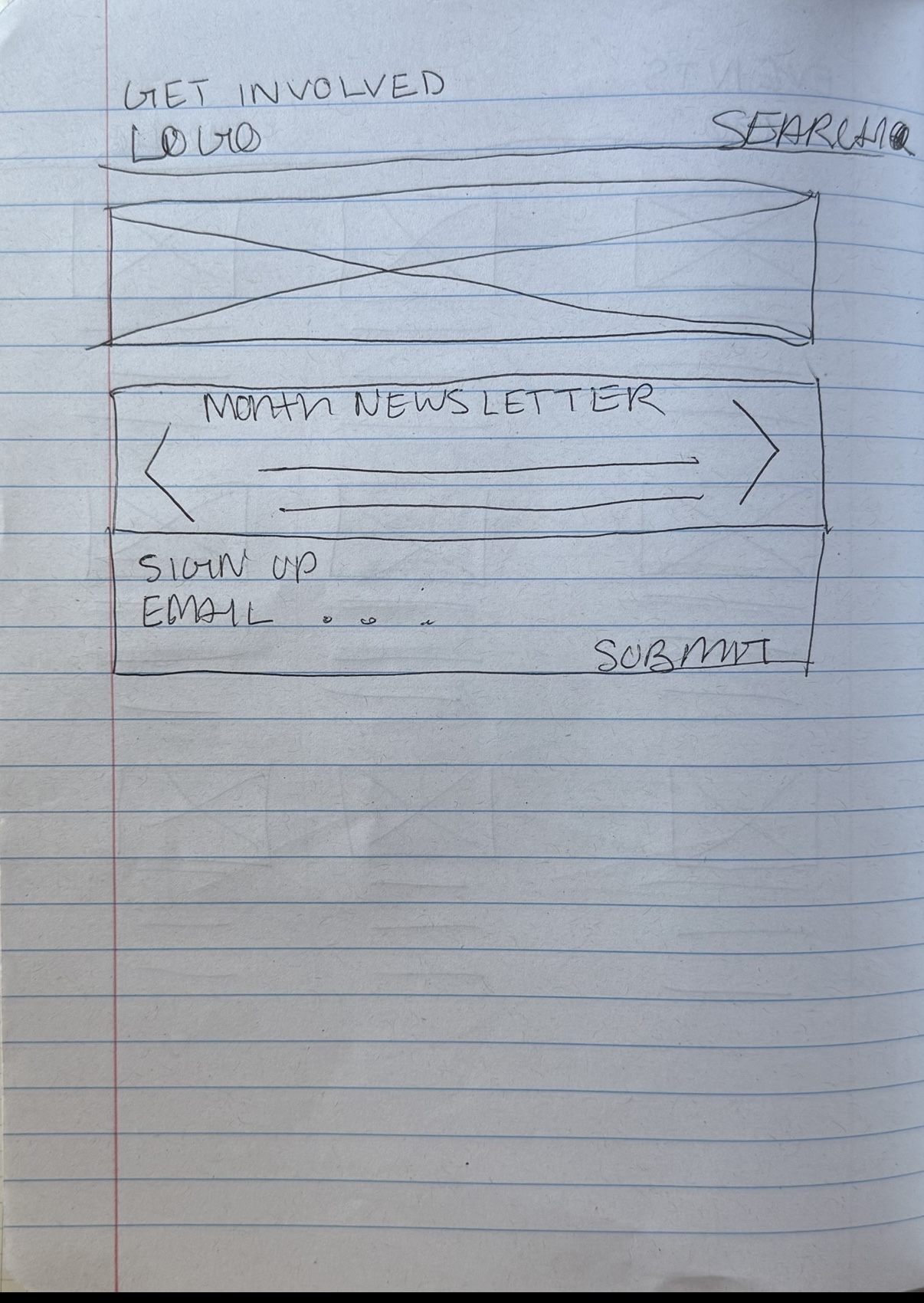
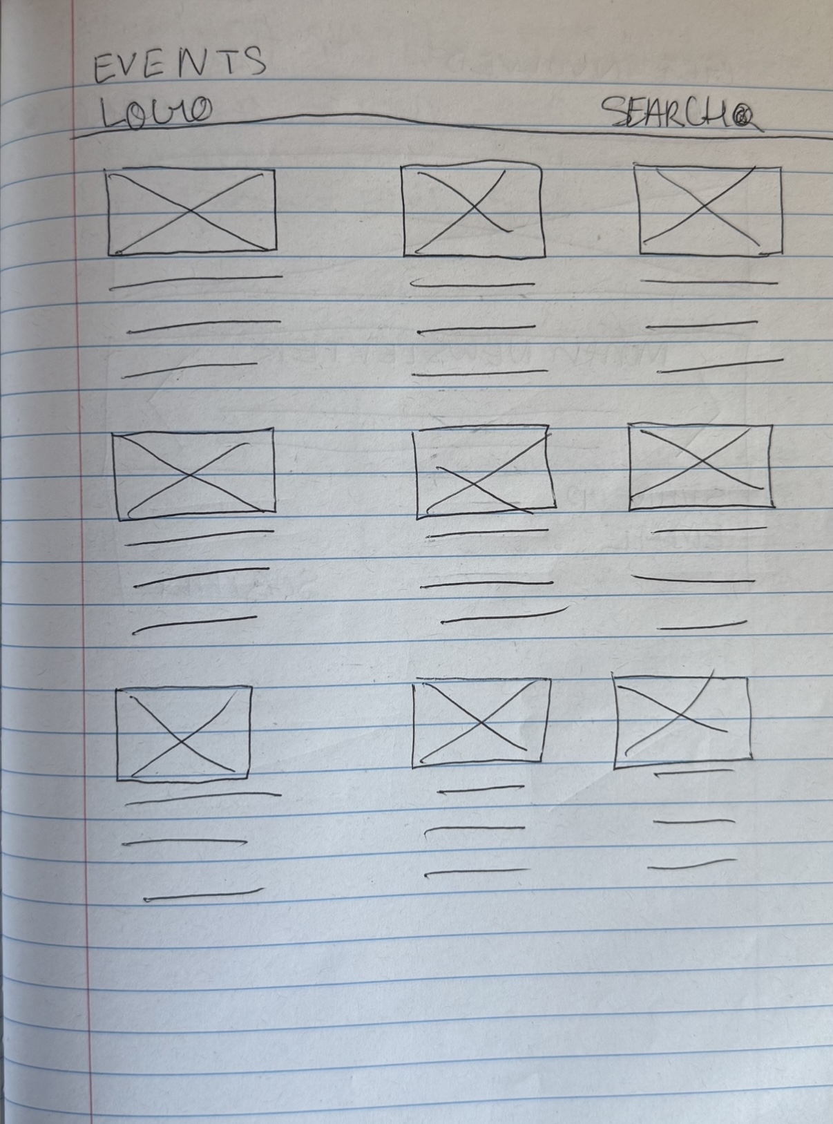
Digital wireframes

Style Guide

Icons


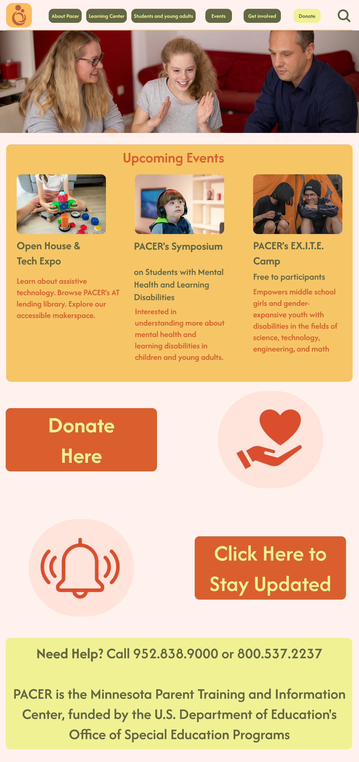
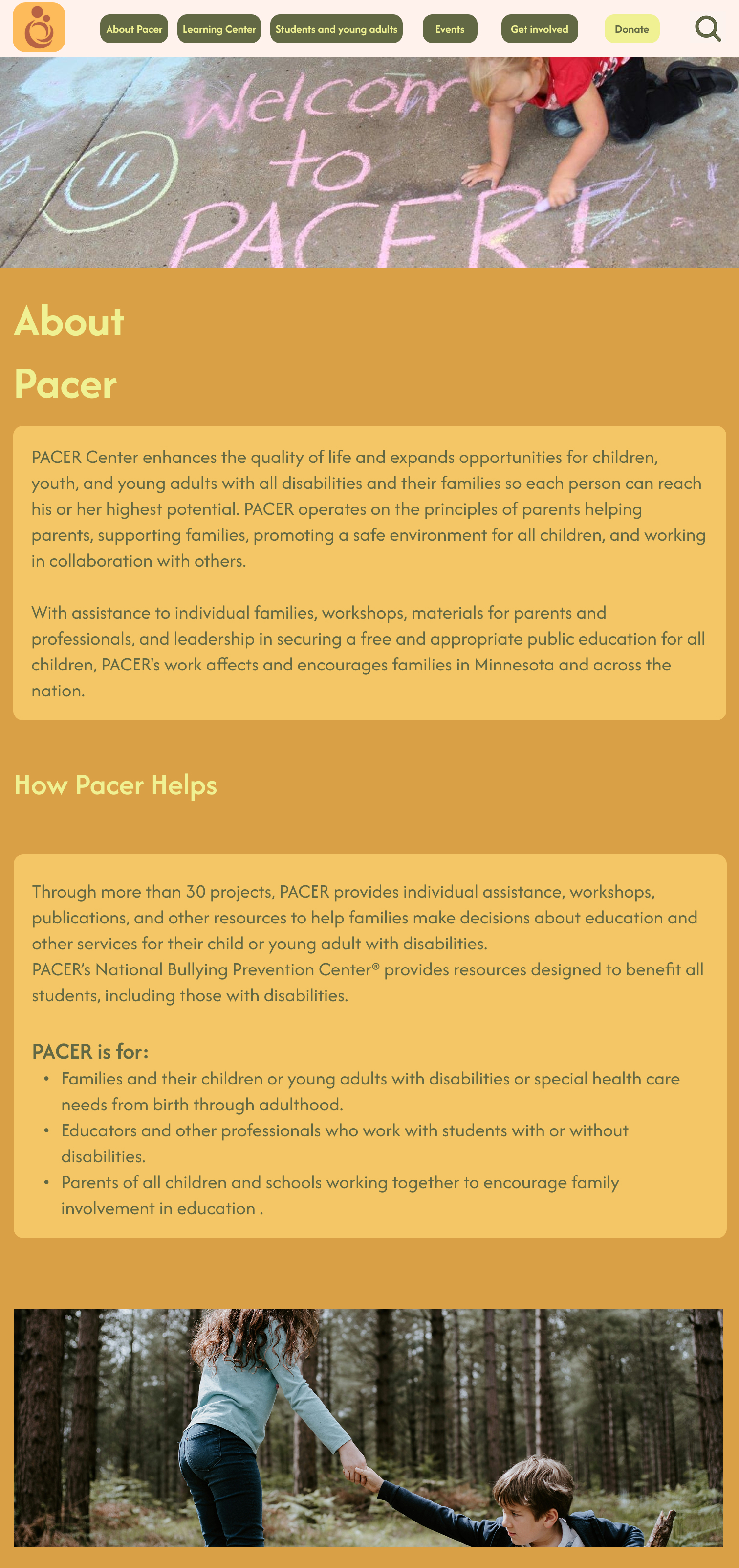
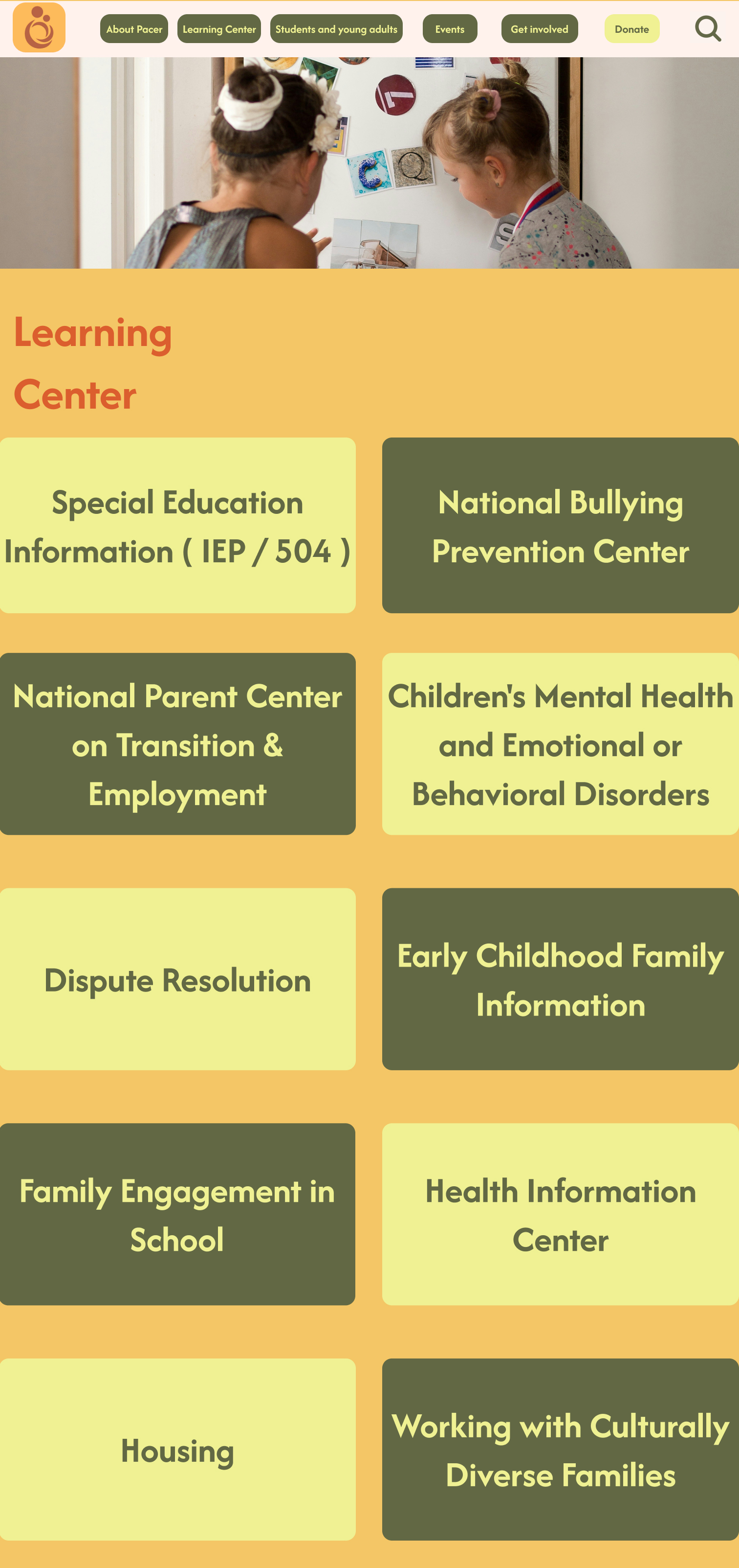
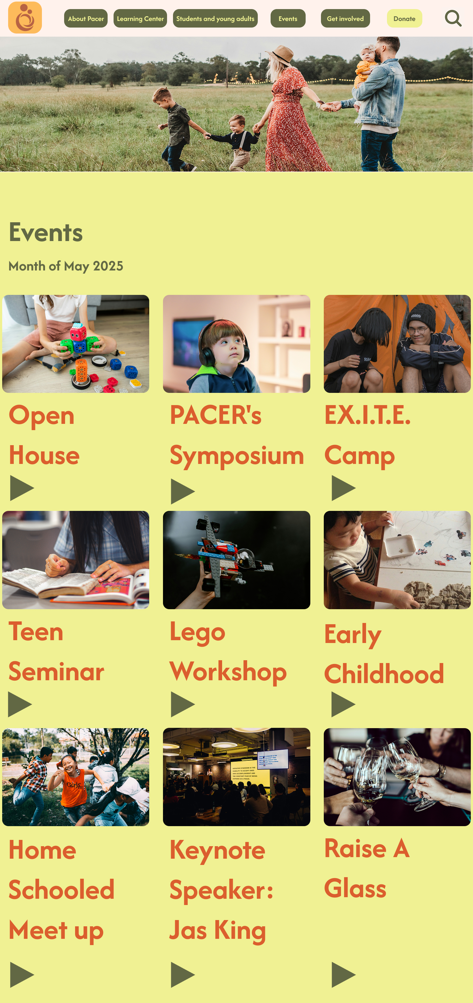
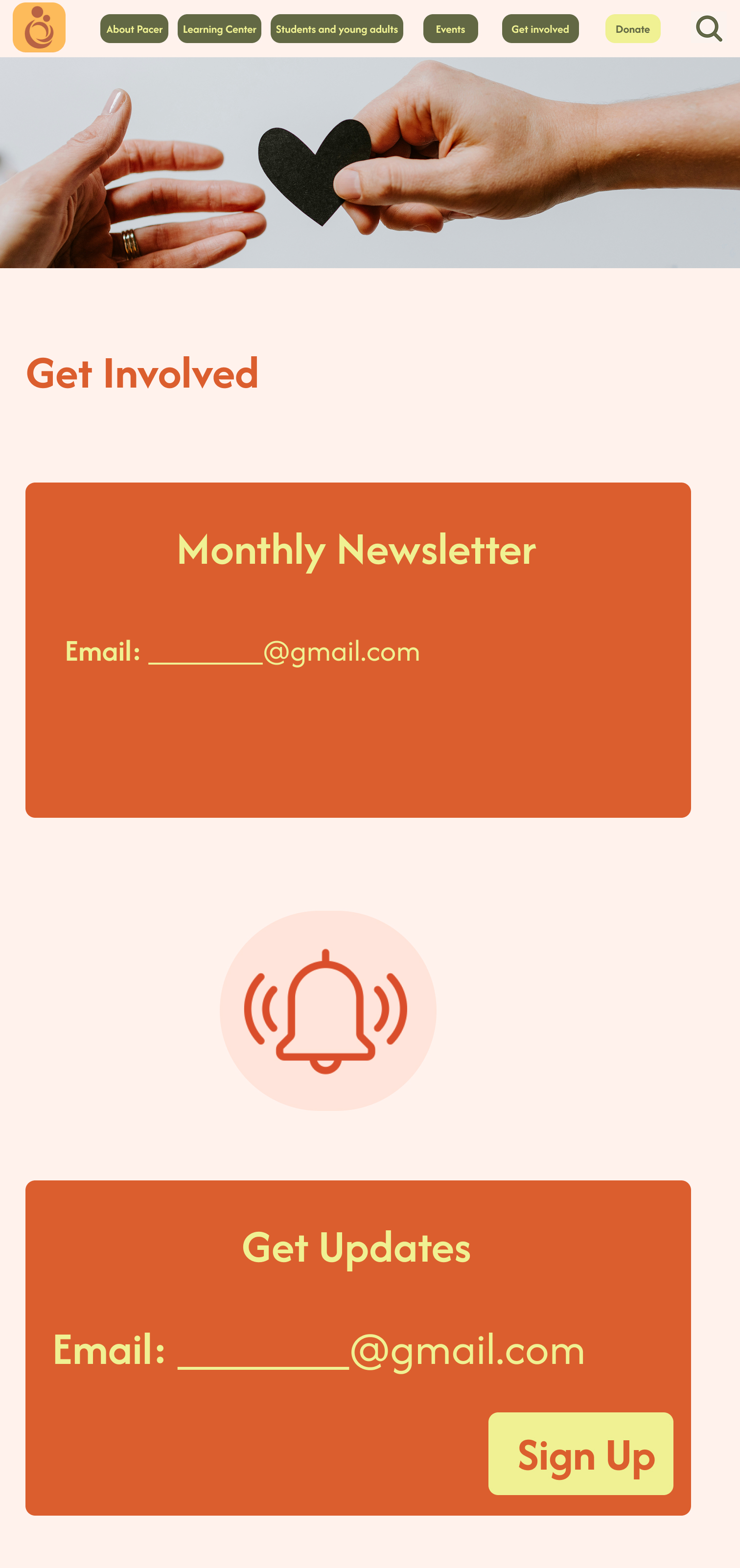
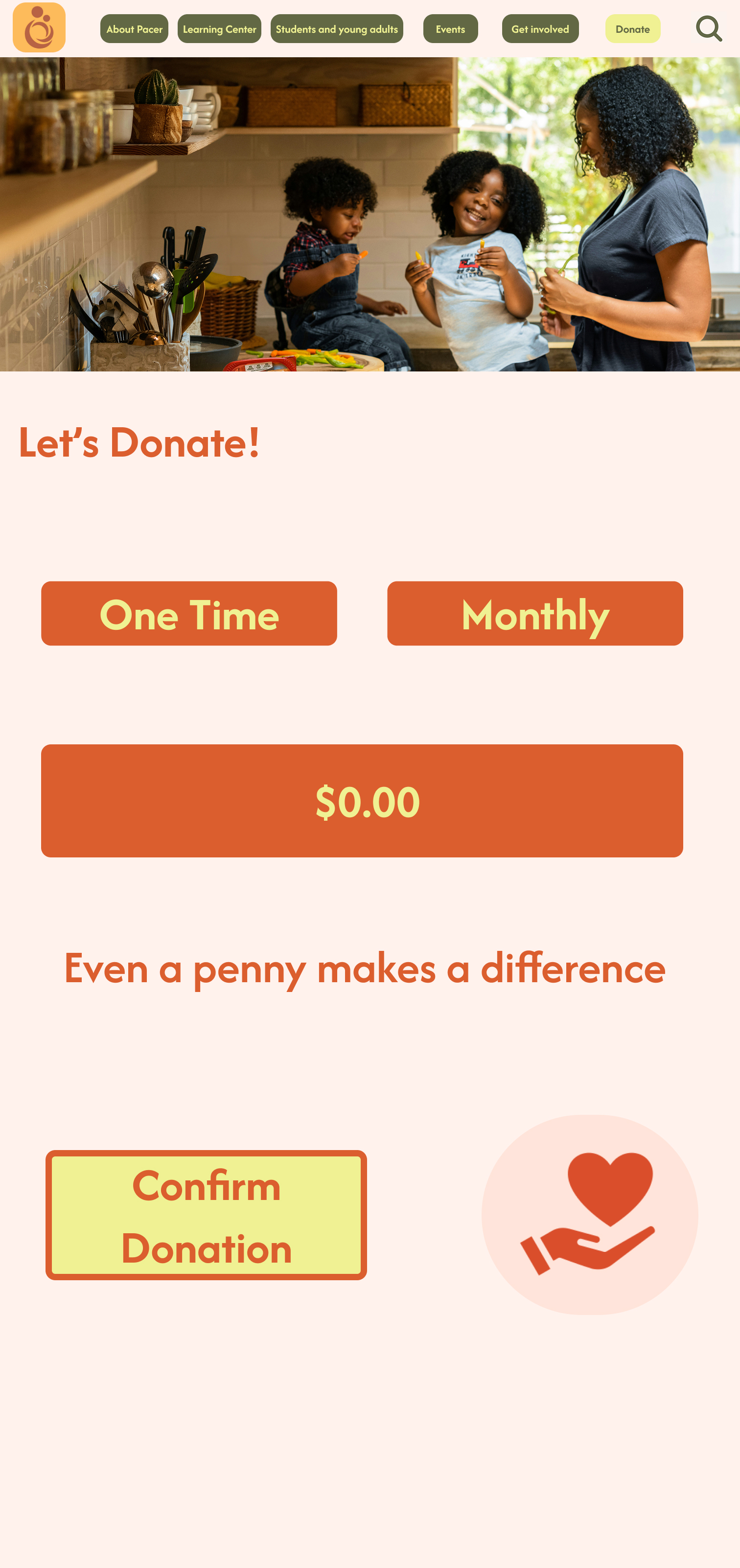
Pages
Takeaways
This project reinforced the importance of designing with empathy, especially when your users include families, educators, and youth with diverse needs. Balancing clarity, accessibility, and warmth was both a challenge and a rewarding learning process.
What I learned:
Accessibility should be foundational, not an afterthought
“Less is more” in both content and structure
Inclusive design is powerful when it’s driven by real voices
Next Steps:
Build out resource filtering logic
Expand youth-focused content
Test more with screen reader and keyboard-only users
Selected Works


